
AI-Generated Content Boosts Overall Conversion by 90%
Increased overall conversion by 90% (2.2% to 4.2% CVR) from organic traffic to sign-up
Client
ContactOut
Timeline
Q2–Q4, 2022
Platform
Website
Introduction 👈
ContactOut is a data intelligence tool that helps recruiters and sales professionals find quality prospects, supercharge LinkedIn prospecting, and automate outbound messaging.
The project aimed to improve the experience of ContactOut's SEO (Directory) pages, using AI-generated content. These pages attract significant search engine traffic, particularly from Google users seeking contact information.
My Role 👩🏻💻
I was the Product Designer responsible for overseeing the project's design and execution phases. Collaborated closely with the Head of Growth, two Engineers, and a Product Manager.
Design and Research Tools:
-
Figma (design & prototyping)
-
Referenced Chart.js
-
Google Meet (collaboration with team)
The Problem 🚩

Having a 77% bounce rate for the SEO pages
The directory pages have a bounce rate of 77% (average should be around 50% – 70%). This metric suggests that visitors exit the pages without engaging much with the content.

Example
-
The current page layout doesn’t optimally utilise space and gives the impression that there’s a lot of missing data.
-
Compared to competitors like Apollo and ZoomInfo, our profile pages have fewer data points — and that looks like we don't have as much data as they do.
Impact
Visitors bounce when the page doesn't meet expectations. This in turn impacts the site's bounce rate, Google ranking and the conversion rate.
Goals 🎯
Business Goals
Use unique content to differentiate ourselves
Differentiate our directory pages from competitors' by curating unique content.
Leverage the organic traffic to drive growth and revenue
Capitalise on the traffic to boost brand recognition, increase signups and revenue.
Increase engagement and visibility for ContactOut
Increase user engagement on the directory pages and reduce bounce rates, while enhancing Google search ranking to drive more traffic and visibility for ContactOut.
Integrate the unique content to the directory pages
Work with the engineers to visualise and integrate the OpenAI-generated content into the directory pages.
User Goals
Unique prospect insights for recruiters and sales professionals
With the insights, recruiters and sales professionals can gain a deeper understanding of prospects and tailor their outreach.
Metrics
Decreased bounce rates
Decrease in the bounce rates, compared to the previous week.
Increase in the average time on page and sign-ups
Increase in the average time on page and sign-ups compared to the previous week.
Impact 📈
Metrics (After)
Post implementation, ContactOut experienced a 90% increase in overall conversion (from 2.2% to 4.2%).
.png)
Business impact
The redesign resulted in an increase in brand visibility (traffic), higher user engagement, improved conversion rates (sign-ups) and increased revenue potential.
Insights 💡
Insight #1
Above-the-fold content* is crucial in capturing visitors’ attention and engagement.
-
Any content that falls in this area is the most important and should encourage visitors to scroll down or click on the CTA.
-
After the visitor has signed up and revealed contact details, it seemed like there isn't much content to browse.
-
Hence, our assumption was that the 77% bounce rate might be attributed to the page layout, and the lack of quality content.
*Content the user can see without having to scroll down

Insight #2
Poor content strategy and a clunky interface impact the brand's perceived value.
The page had oversized and redundant components, making the data and brand seem less credible.

Phase 2
Deciding on which data to implement
Faced with the challenge of incorporating the data into the profiles, I engaged the Head of Growth, Engineers and PM in a collaboration session. Our discussions focused on:
-
Determining the types of data to be featured on the page.
-
Developing methods to calculate prospects' skills and personalities.
-
Strategising the placement of these data points on the page.
-
Figuring out how to visually represent this data through charts and how to implement these across millions of profiles.

Design 🪄
Phase 1
Aligning with stakeholders on which design is the best to implement
-
Kicked off the discussion with wireframes.
-
Post-discussion, we chose the design with the cards as its adaptable and scalable nature allows for easy modification.
-
This flexibility means that the design can easily accommodate new data points without requiring a complete redesign — the team can simply rearrange components as needed.
-
The intention was also to include as much relevant content as possible within the above-the-fold area, for SEO purposes.

The Solutions ✨
Solution #1
Redesigned above-the-fold area to boost sign-up and engagement on page
Given the above-fold section is the first touchpoint for visitors, we've redesigned it to ensure that the components are cohesive, yet distinct from one another. Also, to encourage visitors to scroll down to explore more.
Before

After

Solution #2
Unique data for personalised outreach
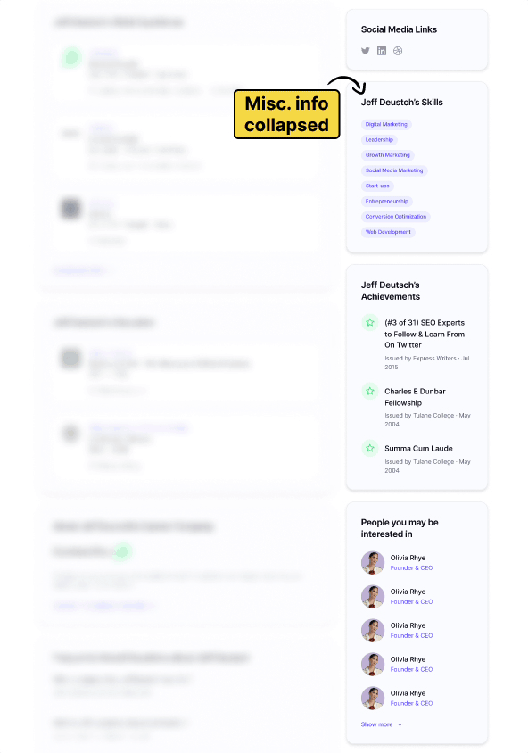
We incorporated unique data components using AI-generated content, to enable recruiters and sales professionals to gain a better understanding of the prospect.
-
Instead of designing the infographics from scratch, I used Chart.js to visualise the data.
-
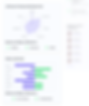
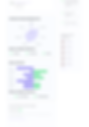
A 'Professional Skills Radar Chart' that offers insights into the prospect's skills.
-
A section titled 'What’s on Jeff’s mind?' that reveals aspects of the prospect's personality and work style.
Solution #3
UI improvements
Further improvements include:
-
Collapsed miscellaneous content to a to save space.
-
Expanded the social proof and CTA sections for conversion.
Before

After
Further iterations & improvements 📈
Version 1.1
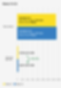
With the new design, visitors spent more time on the page and the overall conversion increased.
There was a notable increase of +6 seconds in the time spent on the page, along with a 4.5% rise in overall conversion.
Version 1.1

Performance metrics
.png)
Version 1.2
After we rolled out the unique data points, the traffic and overall conversion increased further.
After we rolled out the new data elements, there was a 1.5% increase in traffic and a 8.3% increase in overall conversion.
Version 2.2
A simple add-on to what works.
-
Taking insights from the outcomes of V2.1, we left out the dark background and added a CTA button right next to the profile image, while keeping the button in the contact card.
-
This minor adjustment led to a 20% increase in the overall conversion.
Version 1.2

Performance metrics
.png)
Version 1.2
Performance metrics
.png)
Version 2.1
Further improvement — Designed and launched 5 different options to test with 11 participants on Maze.co.
-
Explored different layouts and CTA button placements based on the F-shaped pattern of reading.
-
Came up with 5 options to test — A, B, C, D and E.


Out of the 5 options, the participants voted for Option A, B and D as the top 3 choices.
-
Designs A, B, and D emerged as the top 3 choices.
-
We chose to implement Design B to validate the hypothesis.

Roll back to Version 1.2
When we saw that Option B caused a dip in traffic and conversion, we reverted to the previous version.
-
Contrary to expectations, rolling out Design B resulted in a 48.3% decrease in the overall conversion.
-
To mitigate further traffic loss, we reverted to Version 1.2, which led to an 81.2% recovery in the overall conversion.
Version 2.2

Performance metrics
.png)
Learnings 💭
For a website to work well, content strategy and applying a consistent design language are as important as usability.
-
Without content strategy and a consistent design language, a website ends up being disjointed (even if it's functional).
-
Visitors drop off because the site doesn't meet their expectations, or they don't find value in the content.
-
A bad website experience lowers how people perceive the brand/product, and might lead to missed opportunities.
Using design to facilitate conversations and guide the team to an outcome.
-
Fortunately, I didn't have to figure out the technical aspects because the team knew what to do.
-
My job was to help them visualise the data, and facilitate the build process with my designs.
-
Having different design options on hand helped the team to have better conversations and make sharper decisions.
Set aside assumptions and adjust to user behaviour.
-
When the traffic and overall conversion fell, the engineers quickly switched the design back to its previous version.
-
Being proactive and staying alert to metrics ensures we're always ready to adjust our strategies, so that we can align more closely with user needs.
Future 🔮
For future iterations, we’re considering:
-
Exploration of new data points to further improve user engagement and conversion rates.
-
Conducting further analysis and optimisation — based on evolving user needs and market trends — to stay competitive.
Phase 3
Prototyping and further iteration
Here's the interactive prototype (crafted in Figma), showcasing a revamped profile page with unique data points.
Explore Projects


Insight #3
Use unique content to stand out from the competition
We analysed our competitors’ pages and discovered that the type of data they have were pretty similar to each other, such as:
-
Contact information
-
Professional background
-
Company/organization info
This insight opened a door for us to differentiate ourselves with unique data.
