
Onboarding Improvements Increase Overall Conversion by 21.5%
Improved product activation by 6.4% for the Chrome Extension (82.1% to 87.4% CVR), and a 21.5% increase in overall conversion
Client
ContactOut
Timeline
Q1–Q2, 2022
Platform
Chrome Extension
Introduction 👈
ContactOut is a data intelligence tool that helps recruiters and sales professionals find quality prospects, supercharge LinkedIn prospecting, and automate outbound messaging.
In this project, we focused on optimising the onboarding experience for the ContactOut Chrome Extension.
My Role 👩🏻💻
I was the Product Designer responsible for the research, ideation and overseeing the design implementation. It was my first project at ContactOut. Collaborated with the Head of Product, two Engineers, and a Product Manager.
Design and Research Tools:
-
Figma (design & prototyping)
-
Google Meet (collaboration with team)
The Problem 🚩

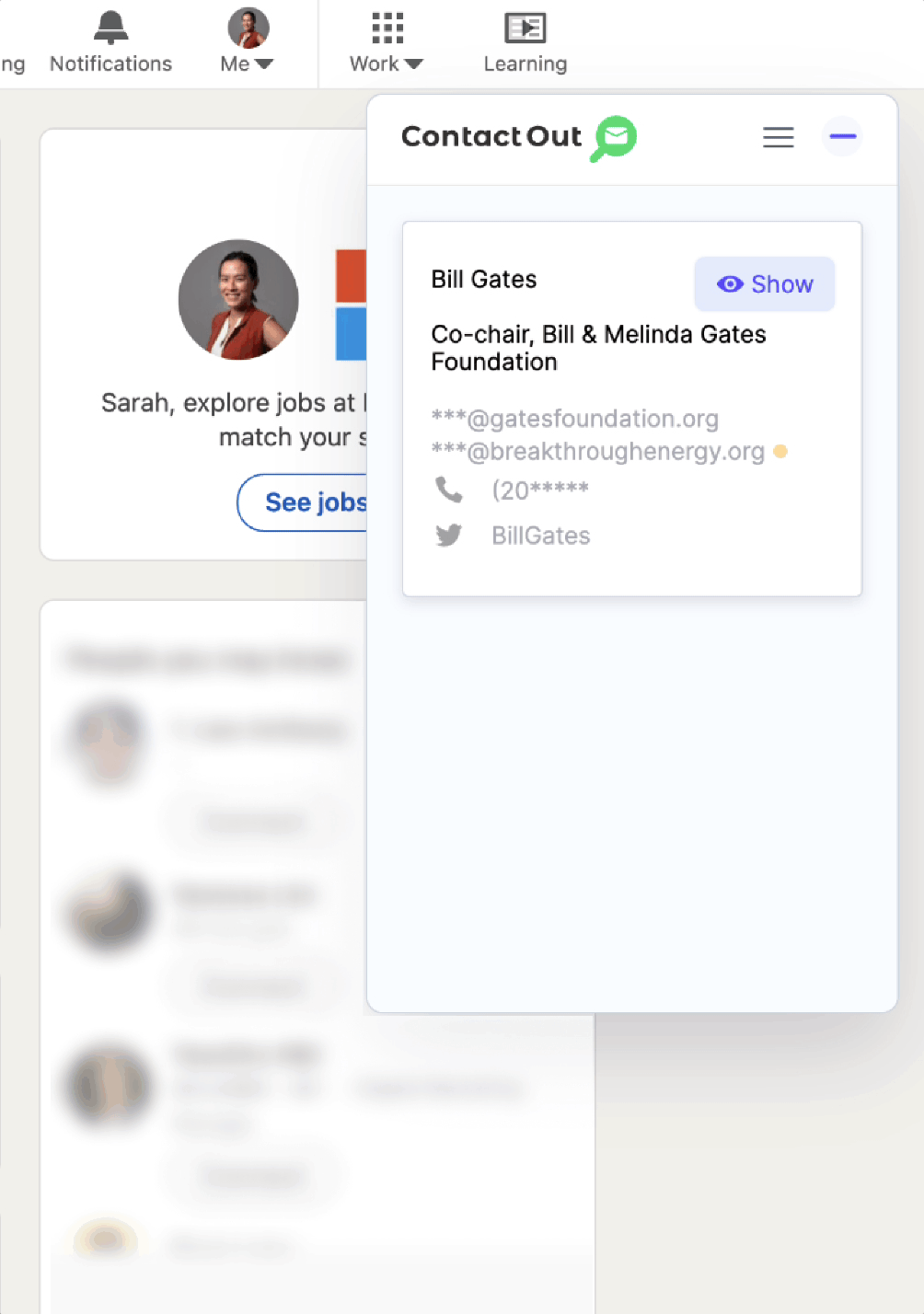
Lack of guidance during onboarding
The removal of the Feature Explainer popup (How to use ContactOut) has caused a gap in the onboarding journey. This popup contains a step-by-step guide to help new users understand how to use the extension.
Example
Without clear instructions, users landing on the Bill Gates demo page are left uncertain about the next steps — how to reveal contact details and move on to explore more LinkedIn profiles.
Impact
This lack of direction has resulted in users dropping off during onboarding, thus impacting user activation and retention.
Metrics (Before)
We initially thought that removing the feature explainer popup would reduce the information overload in the first few steps of onboarding.
However, the data proved otherwise: There is a 17.8% drop-off from Download > 1st email reveal (activation event).

Goals 🎯
Business Goals
Reduce the drop-off during onboarding
Target to lower the rate at which new users drop off between Install > Activation (1st email reveal), ensure they complete the setup and do the 1st email reveal.
Boost user engagement and retention
Focus on enhancing user engagement with our extension from the 1st email reveal, encouraging them to become regular users.
User Goals
Seamless onboarding to 1st email reveal
Collaborate with engineering to bridge the gap between "Install" and "Reveal", by designing a guided onboarding flow that leads users from Install > 1st Email Reveal.
Make onboarding fun and rewarding
Intuitive onboarding for new users
Develop a user-friendly interface that makes revealing contact details a straightforward process.
Metrics
Decreased drop-off
Decrease in the number of users who drop-off between the Download > 1st reveal, compared to the previous week.
Increased activation
Increase in the number of 1st reveals by new users compared to the previous week.
Explore Projects


Impact 📈
Metrics
Post-launch
-
21.5% increase in overall conversion (Sign-ups > 1st Reveals), from 35.2% to 43.7%.
-
New users revealed contact details 6.4% more often than before, as the conversion rates from (Download > 1st Reveal) increased from 82.1% to 87.4%.

Business impact
The redesign resulted in a higher user conversion rate, positively influencing the brand's reputation and revenue.
Insights 💡
Insight #1
New users need clear steps to move forward smoothly; Assuming that they will navigate forward without explicit instructions would likely lead to user disengagement.
While our scope for in-depth user research was limited, we leveraged what we could by performing a screen-by-screen evaluation of the current Install > Onboarding flow.
-
It may be obvious to click on ‘Show’ and navigate to the next profile. However, that may not be the case for a new user — the lack of clear instructions was glaring.
-
This gives the impression that the product is broken.
This insight was pivotal; it steered our entire design process towards clarity and engagement.

Insight #2
Proactively addressing edge cases and technical constraints helps prevent potential issues from escalating into larger problems in the future.
We identified a few key areas:
-
Importance of the spam filter: For any user rewards system (like giving away free credits for completing a step) a backend spam filter is necessary to maintain security and fairness for all users.
-
Technical constraints: We needed to ensure that the designs fit within technical limitations.
-
Going beyond the 'happy flow': Developing solutions for cases like, i.e. When a user opts to skip onboarding etc.
These discoveries were vital in crafting a design solution that was user-friendly and agile, accommodating a range of user experiences.
Insight #3
The product works okay, but to keep up, we need to make the experience more personal and engaging, similar to what our competitors are doing.
-
In a highly competitive market, understanding where we stood as compared to competitors like Apollo and Lusha was key — so we analysed their product onboarding flows.
-
Turns out, we need to make our welcome clearer and add a personal touch to show users how the product works.

Design 🪄
Iterations
Many design iterations stretched across Q1–Q2 (A result of not having a proper kick-off at the start)
-
We found ourselves in a constant back-and-forth with the engineering team, deciding what was feasible and what wasn't.
-
This led to numerous revisions as we sought out a workable solution to implement.
Prototype
Finally, the prototype!
Crafted using Figma, the interactive prototype presented a redesigned onboarding process. Feedback from stakeholders helped to further refine the design.
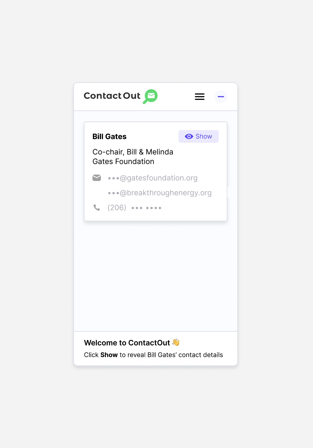
Before — No instructions
After — With instructions at the bottom
Solution #2
Credit reward system with a progress bar + further discovery
-
As one of the business goals was to encourage new users to reveal contact information, credits are rewarded as they reveal more contacts. This helps to boost user engagement and adoption.
-
After users have revealed 10 profiles, they are prompted to head to the Dashboard to continue discovering the product.
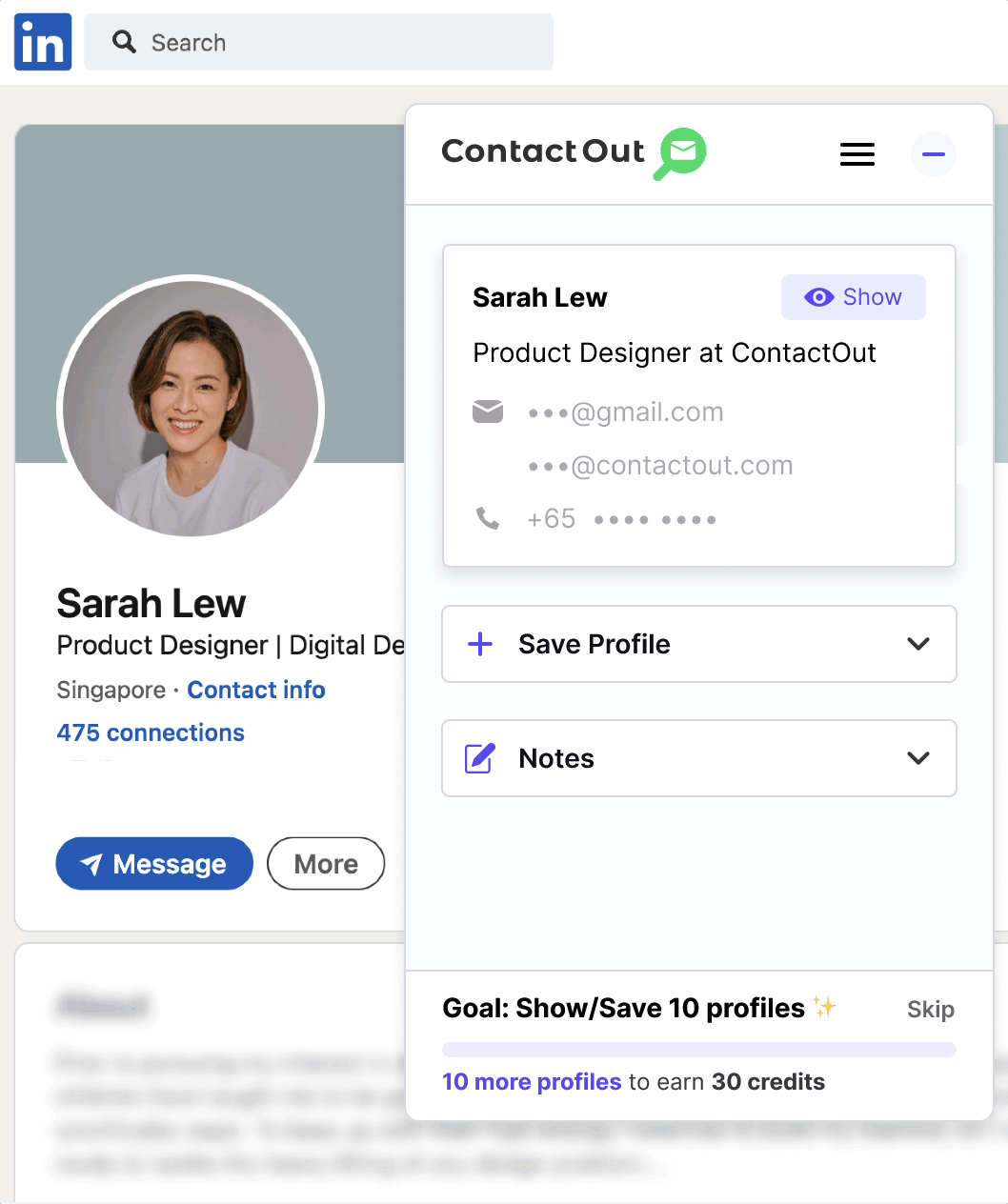
The Solutions ✨
Solution #1
Guiding users to the ‘aha!’ moment with the onboarding banner
-
Based on the UX audit, it is recommended that users are presented with clear instructions.
-
Hence, there’s a welcome screen + instructions to prompt users to complete the first task of revealing contact details.
Future 🔮
For future iterations, we’re considering:
-
Implementing widgets and surveys to gather direct user feedback.
-
Advance the onboarding journey to improve user retention, for instance, by using checklists to guide users and visually indicate their progress.
-
Customise the onboarding for distinct user segments, like recruiters or sales professionals, ensuring a more targeted experience that addresses their unique challenges and requirements.
-
Due to the abuse by spam users, we have eliminated the credit rewards system and will monitor its impact on conversion rates thereafter.
Learnings 💭
Poor onboarding can influence the impression users have of the product and brand negatively.
When users feel lost or uncertain during the onboarding stage of a product, they're less likely to stick around to explore the benefits.
Kick-off with the engineers early. Work and test with existing components — only build from scratch when it's absolutely necessary.
-
Early collaboration with engineers is crucial to minimise design roadblocks (and going back to the drawing board).
-
The project would’ve taken less time and effort if the 80-20 rule was adopted from the start.
-
Focusing on solutions that require minimal effort but yield substantial impact rather than starting from the ground up.
Acknowledge and work with technical constraints.
-
Understand technical limitations and complex scenarios.
-
Crafting designs for a variety of user cases.
-
Incorporating the credit reward system with existing spam filters.